Tremti Charts |
||
Trend |
Emotion |
Timing |

Dr. Oliver Reiss, CFTe, MFTA – the originator of Tremti-Charts.
Working in the finance industry for more than 25 years with main focus on risk management and the corresponding IT implementations, I’m also very active in the Technical Analysis community, serving as regional deputy manager for the VTAD in Dusseldorf, Germany and I’m also member of the board of directors of IFTA.
With my science research background (Master of physics, Ph.D in mathematics) I like to combine Technical Analysis with modern mathematics or rigid statistics and my NAAIM – rewarded paper “Trend–Emotion–Timing” provides the foundation for the Tremti-Charts and a link between Technical Analysis and Portfolio Management.
To illustrate the idea based on an outdated chart of the DOW consistuents: Each stock is represented by an anchor, stocks in the red area are in a down-trend, while stocks in the green area are in an up-trend. The higher (closer to the top), the more overbought is the stock and stocks shown at the bottom are oversold.
The golden lines show the area of good swing trading candidates, hence in up-trend but oversold (long candidates) or vice versa in the top left corner.
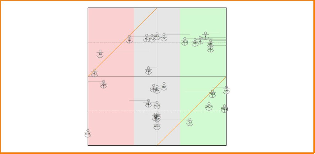

Together with the volatility of the stock, this approach also provides an opportunity to construct an optimized portfolio.
The rewarded paper is published in the IFTA Journal 26, pp 75-82.
I inspired my VTAD colleague Jan Zuleeg to build a regular analysis for the stocks of the Dow Jones Industrial index on his web site.
Interested in more Tremti-Charts views on several market of stocks? Just join my free substack: